In an interactive project, it is important to have a good understanding of what makes a good interactive product. Interactive products can include websites, posters, mobile phones and more. An interactive product, to word it simply is a product which requires the user to interact with the said product, for example using a mobile phone and reading a poster.
A good website should include an easy-to-use interface above everything else. Content is of course important, but this content must be easy to find which on a good website, will indeed be easy to locate. But on a badly-composed website, nothing will be easy to find and this will of course impede on how much the user can explore your website and thus how positive their opinion of your website will be.
Examples
Below is a well designed website.

In my opinion, Falmouth University have an excellent website with an easy-to-read and easy-to-use layout, attractive and bold text and a diverse yet muted colour scheme which I believe overall contributes to a pleasant website-navigating experience for the user.
Below is a well designed mobile-phone.

The Samsung Galaxy S22 Ultra is considered to be a very well-designed mobile phone. Designed to fit comfortably in the user’s hand and provide an easy and pleasurable user-experience which makes the product more attractive and ultimately, helps it compete against the competition. Ease-of-use can set products apart from each other and this is notable in mobile-phones. What they are like to hold, how easy to use the menus are and the general design of the fonts all contribute to the general ease-of-use of a product.
Below is a well designed poster.

Above is a poster for the musical duo ‘she & him’, the poster that the duo used has been credited as being a triumph in poster design, with a good colour-scheme of light beige, dark golden colours and black. This simple colour-scheme, teamed with the tasteful and minimalistic nature of the poster creates an excellent and innovative design. When we look at the aspects of the image, we can see two paintbrushes being used in a circular motion to paint a spherical image, which over time creates the appearance of the grooves of a vinyl record and thus the image becomes focused on a vinyl record with a golden centre. The font is tasteful and works very well with the refined and sophisticated, yet easy-to-understand and somewhat minimalistic nature of the poster.
Below is a badly designed website.
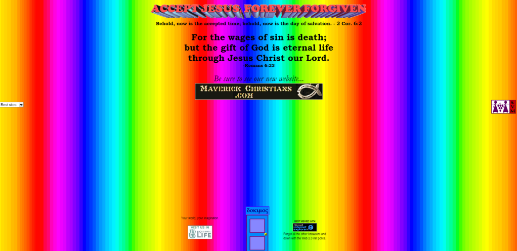
The above is an example of how not to make a website. The colours clash horrifically with each other with an over-saturated, rainbow colour gradient with image quality to poor, that one can see the pixels which should never be the case. Secondly, there are far too many blank spaces on the website and this makes the page look even more amateurish. The texts and fonts are awful, with a 3D font at the centre-top of the screen, followed shortly by a black sub-heading underneath which is very hard to read and of course, black fonts do not work well over multi-coloured backgrounds. There is little to no organisation in this website and apart from the low-quality logo in the middle, we also have some other small icons for the user to click on the edges of the screen. These icons raise another concern, the viewer has no idea what they do which sums up the website entirely. Nothing is clear and the website is very badly-presented. Ease-of-use with regards to website navigation would be a challenge on this website.
Below is a badly designed mobile-phone

The HTC Status is a mobile-phone which at one point came under fire for bad design, with screen size being sacrificed to fit a clunky keyboard, a gratuitous Facebook button which a lot of users did not even really need and of course the low-resolution screen with the crowded menu and overall, badly laid-out screen design with hard to find icons, colours which did not compliment each-other and a clock icon which repeats itself once in the top-right and once again in the centre of the screen which is completely unnecessary and adds to the overall crowded and impractical design of the mobile-phone.
Below is a badly designed poster.

Aside from the poor resolution, there is a lot to talk about when it comes to how badly put-together this poster is, which is exactly the problem. The poster is far too cluttered with pointless and inflated icons, a distasteful colour-scheme, a variety of equally unappealing fonts and overall it is a failure in poster design. Posters above all, require clarity and there is none to be see here, more often that not, those passing a poster will not have long to look at one and will require their message to come across fast. If this is not the case, then the poster will fail to do its job of commercialising and/or advertising.
Conclusion
To conclude, a good design is crucial to any piece of. interactive media, as how you brand yourself is an insight ti your capabilities as an individual and of course, your professional practice. First impressions are very important and if one’s first impression of you is via poster or website, then it must be one that paints you out the way you would hope. One that would paint the individual out as capable, reliable and tasteful.
