
TearFund are a charity dedicated to helping those less-fortunate than ourselves in the developing world and provide nourishment, medical help and education for people who come from places where any sort of opportunity is hard to find. TearFund is active in 51 countries globally and do what they can to help those in need in impoverished countries.
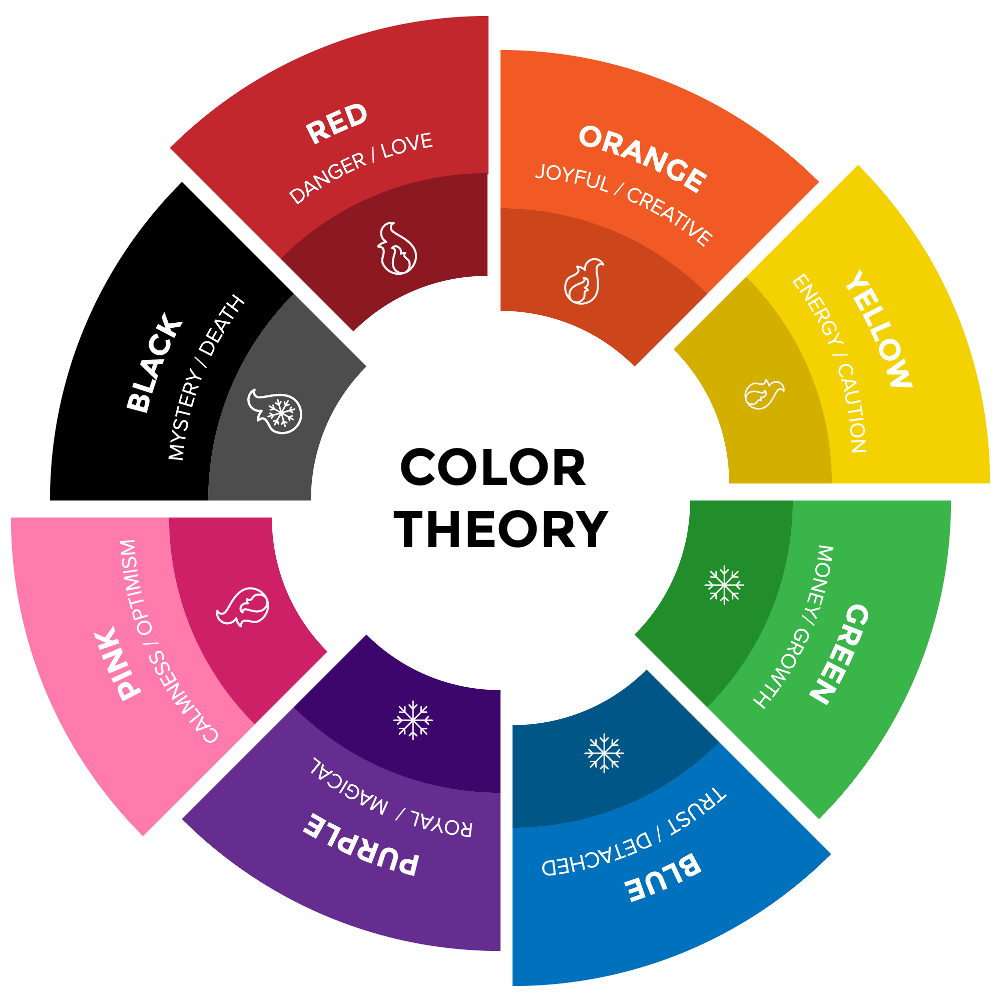
TearFund use a very dark, almost grey shade of blue for their background and have a white font with a letter ‘T’ which represents the crucifix, which is a global symbol of christianity. The dark blue represents peace and trustworthiness with the darker shade of the blue representing the melancholic nature of what charity work. Charity work is something that is not the most positive of organisations, it exists due to the wealth imbalance across the world and the dire conditions that some people live in day to day. TearFund work to help those in need and I believe that the logo does a good job of conveying what TearFund are all about and what they hope to bring to the world.